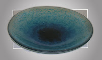
For this community, baptism is the central rite. Nancy describes what they were looking for in art glass: “They wanted to see the water in action…they wanted a big bowl, nice shallow curve so the water would be scoopable, clear glass with a wavelet pattern in blues, darker in the center and fading toward the rim.” The font was to be situated in the center of the space, located in a stand that would reveal the water to the congregation.
 |
| Nancy made a variety of bowls. |
Said Nancy, “I’ve made many glass bowls, but none that big. I knew there would be a number of samples made until I got it right and could present the best one.” Nancy made a number of fused glass test pieces in the Washington Glass Studio.
Nancy was concerned about how the colors looked and how the edges would be finished, as well as how deep a bowl profile was needed.
 |
| Test 3 – issues arose on how the glass edges could grab the sides of the molds as it moved down. |
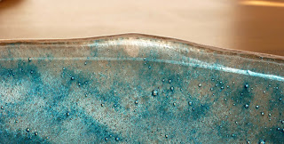
Nancy said of her test process, “I made glass sandwiches, (colored frit fused between two sheets of glass). I knew this method could be risky, as bubbles could form as the trapped air is locked between the sheets of glass as the glass melts. Bubbles are part of glass, and my worry was, how big is too big?“
Nancy also wanted to emphasize the feeling of rippling water. “In the first go, my wavelets looked like little upside-down drawings of seagulls. The second try I got a lot of big bubbles at the rim. On the third one, I tried avoided bubbles by filling in with clear frit, which did not turn out well!” she explained. In the final glass baptismal font, the aqua colors of the frit have a nice, soft undulating texture.
 |
| Senior Pastor Deborah McKinley at the Baptismal Font |
The glass baptismal was completed and installed in time for the Easter holiday, and the glass was well received by the Lewinsville congregation. Well done, Nancy!